

From the first sketch to the centenary logo, the Lufthansa crane has changed many times over the years. And yet, at its core, it has always remained the same. It is one of the oldest continuously used trademarks in aviation and is considered one of the most successful logos ever. But this bird is more than just a logo: It symbolizes the history of a global brand and for over a century has stood for trust, new beginnings, and the ability to reinvent oneself.


The birth of a trademark
The year is 1918. In a Berlin studio, the architect and graphic designer Otto Firle makes a simple sketch of a crane for Deutsche Luft-Reederei [German Air Shipping Company], using just a few lines. It is intended to embody the combination of movement in flight and technical precision – a large, ascending bird that represents progress, elegance, and the new freedom of air travel. What begins as a simple emblem ultimately proves powerful enough to sustain a brand for over a century.


In 1926, Deutsche Luft Hansa A.G. is created out of the merger of Deutsche Aero Lloyd and Junkers Luftverkehr. Originally designed by Otto Firle for Deutsche Luft-Reederei, the crane had already been transferred to Deutsche Aero Lloyd in 1923 and now finally becomes the emblem of the first Lufthansa. The company also adopts Junkers’ blue and yellow colors – a combination that, together with the crane, will soon be inextricably linked to flying “made in Germany.”
With the rise of civil aviation in the 1920s and 1930s, the crane becomes a constant companion of the first Lufthansa, adorning aircraft, posters, flight schedules, and brochures. A strict corporate design is not yet in existence, but one thing remains constant – the crane as a compact, memorable symbol with a strong visual impact. In the 1930s, Lufthansa increasingly becomes part of the National Socialist regime, and the company gets involved with propaganda, rearmament, and the wartime economy. The free development of advertising design is halted, and while the crane remains the symbol, it is now used for propaganda purposes.
New beginnings and new designs
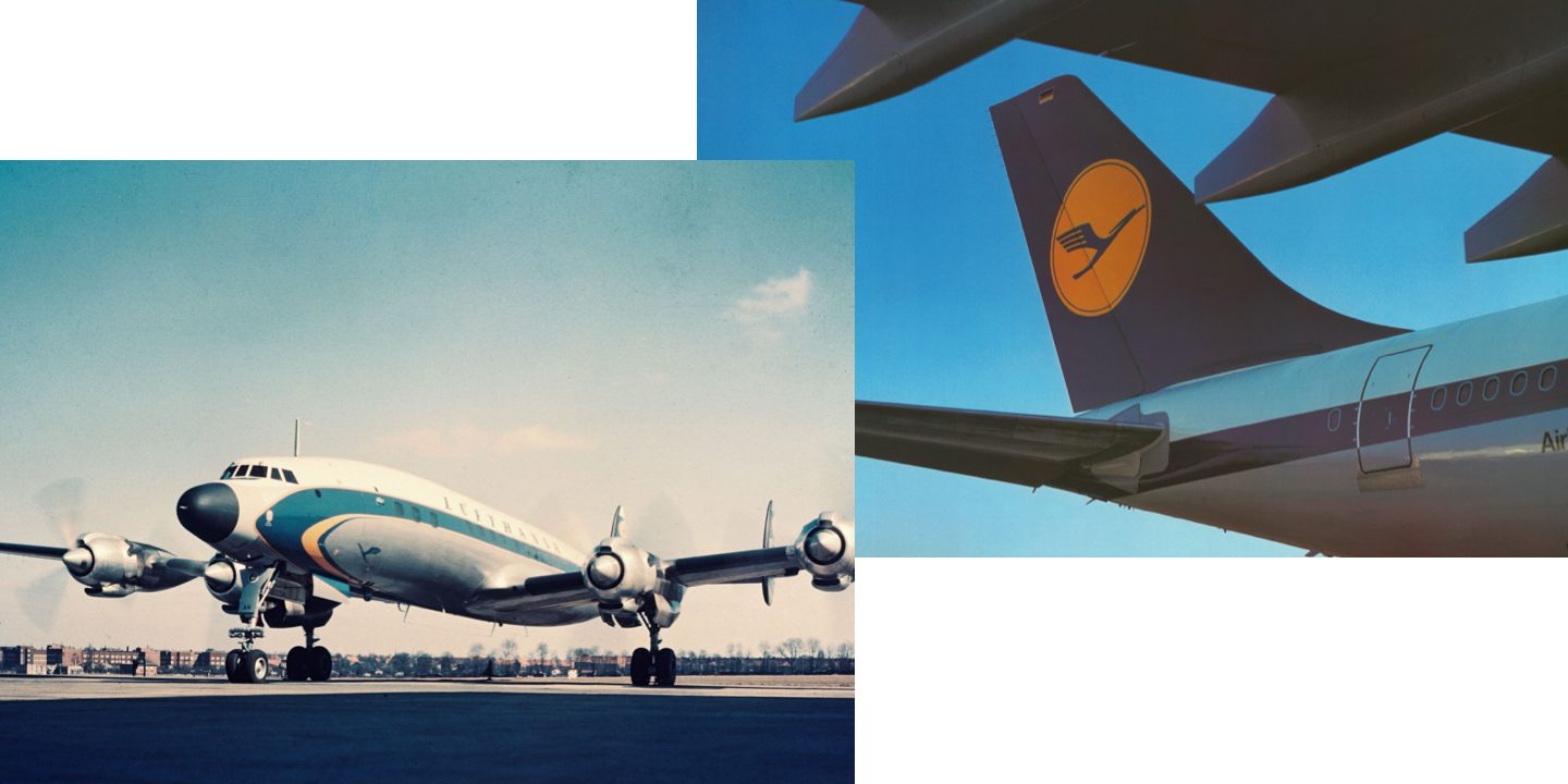
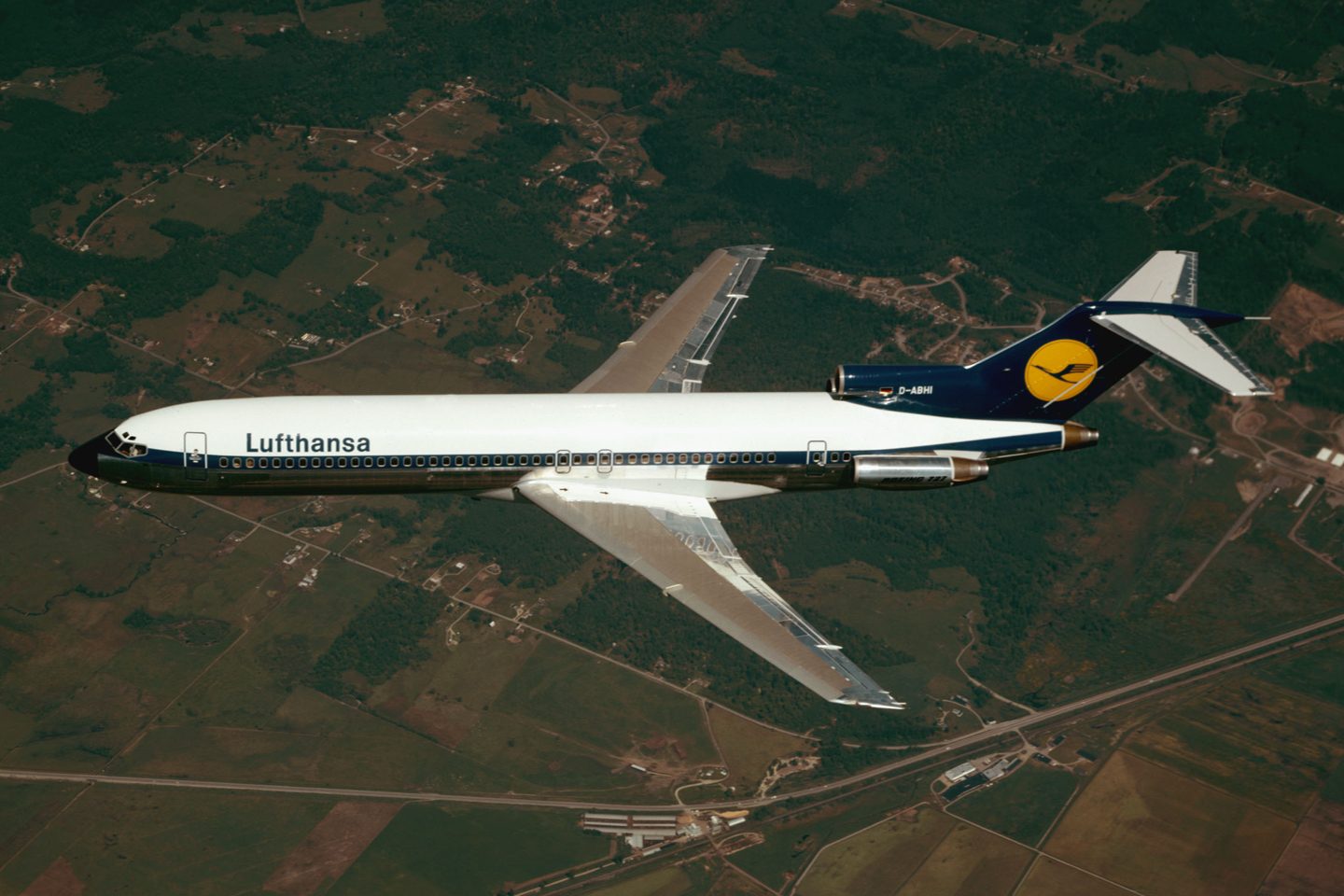
After the war and the company’s re-establishment in 1955, Lufthansa consciously builds upon its pre-war visual heritage. The crane logo remains, as do the blue and yellow colors. On the first Convair aircraft and Lockheed Super Constellations, the fuselage and tail unit once again sport blue and yellow and, alongside them, the familiar, curving image of the crane flies off into the world. Formally, the crane still clearly shows the hallmarks of the 1920s: A graceful, Art Nouveau-inspired outline and organic curves that perfectly complement the streamlined design of the Super Constellation.
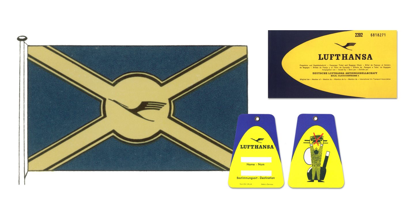
During these years, the crane’s impact is above all, as an emotional symbol of recognition, signifying continuity, reliability, and German craftsmanship. However, the imagery surrounding it is far from consistent: posters, brochures, and advertisements use a variety of illustration styles, colors, and layouts. Sometimes the crane appears as decoration, sometimes almost randomly, incorporated into a multicolored, somewhat haphazard design. What is consistent is the parabola on the tail unit and the bird as the main element. But the set of design rules that will later turn it into an icon is yet to appear.


From decorative bird to modern figurative trademark
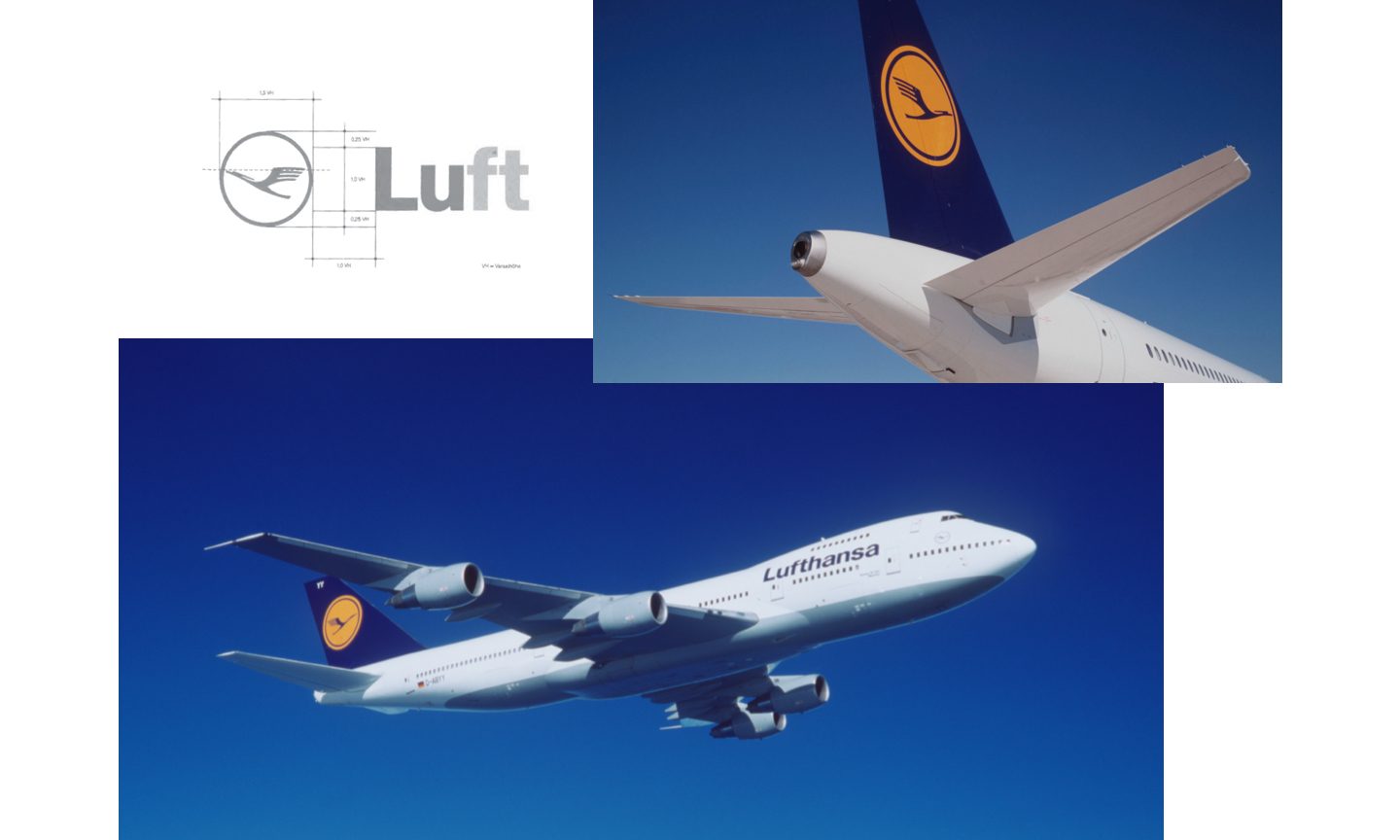
The real transformation into a design icon begins in the early 1960s. Within the company, there is a growing awareness that the strong figurative trademark needs an equally strong design framework – especially in the context of international operations. It is precisely at this point in 1962 that Otl Aicher embarks upon Projekt 1400. Together with the E5 Development Group, he begins redesigning the crane logo at the Ulm School of Design, revolutionizing the design principle using a rational, functional aesthetic that has a significant impact on Lufthansa’s corporate identity.
As a result of the Ulm School’s redesign, the crane finally becomes a system. It acquires fixed proportions, defined colors, and clear rules of application. By the mid-1960s, the image that would become known worldwide is appearing on the tail units of the fleet: a blue tail fin with a yellow circle and a blue crane. At the same time, the rules are established, describing how the figurative trademark should appear on tickets, bag tags, and in architecture – unchanging, never distorted or turned into mere decoration. The crane thus becomes the visible anchor in an increasingly complex world of brands.

The canary disappears – the crane remains
In the 1970s and 1980s, aircraft types, cabins, markets, and expectations are changing – but the crane remains. What does evolve are the colors and their applications: the yellow becomes warmer and the blue darker. In 1978, specific standard colors RAL 1028 Melon Yellow and RAL 5022 Night Blue are introduced for the emblem, ensuring the crane’s consistent appearance across the world. At the same time, greater emphasis is placed on the overall onboard experience – seats, fabrics, lighting, and service areas incorporate the colors of the crane, making the figurative trademark tangible even in the cabin.
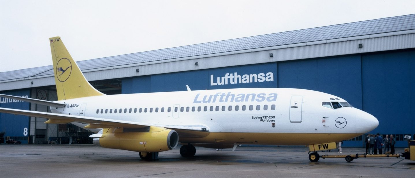
In 1988, a wide-ranging study reveals that Lufthansa is perceived primarily as a remote, business airline. In this context, the decision is made to create a more emotionally engaging brand image. The eye-catching yellow is given greater prominence, allowing Lufthansa to stand out more clearly from its mostly blue-dominated competitors. The crane itself remains unchanged, but its backdrop becomes brighter: yellower tail units, more yellow in the cabin, communications materials with yellow highlights. However, some of these designs go so far as to encounter significant internal resistance. Employees start calling the crane the “flying canary.”
Ultimately, continuity prevails: the crane in a circle stays as it is – the calm, reliable center. Around it, colors, materials, and backdrops are adapted to appear closer, warmer, and more contemporary, without compromising its iconic character.
Tradition within progress
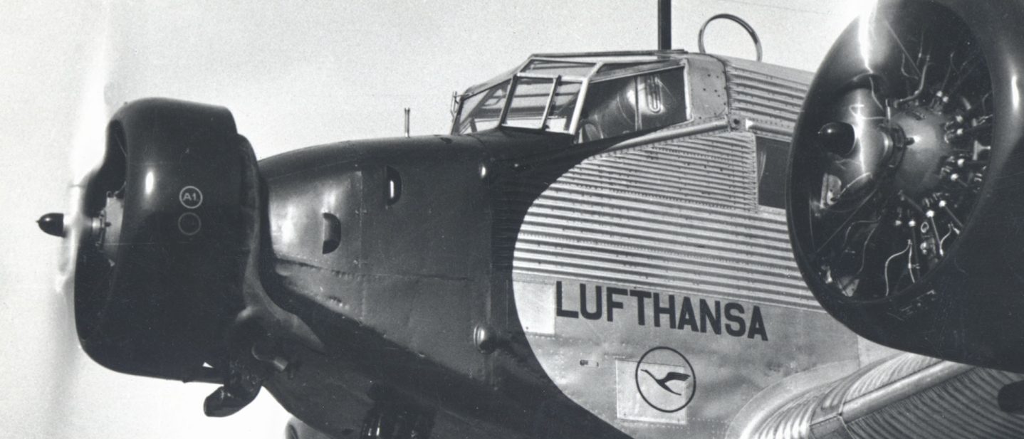
In 1996, Lufthansa’s history is not only visually evolving, but the desire to create an emotional connection to the company’s heritage is also intensified. Working with the California studio Frog Design, counters and cabins are conceived in a retro-futurist style that consciously references the legendary corrugated iron skin of the Junkers Ju 52.

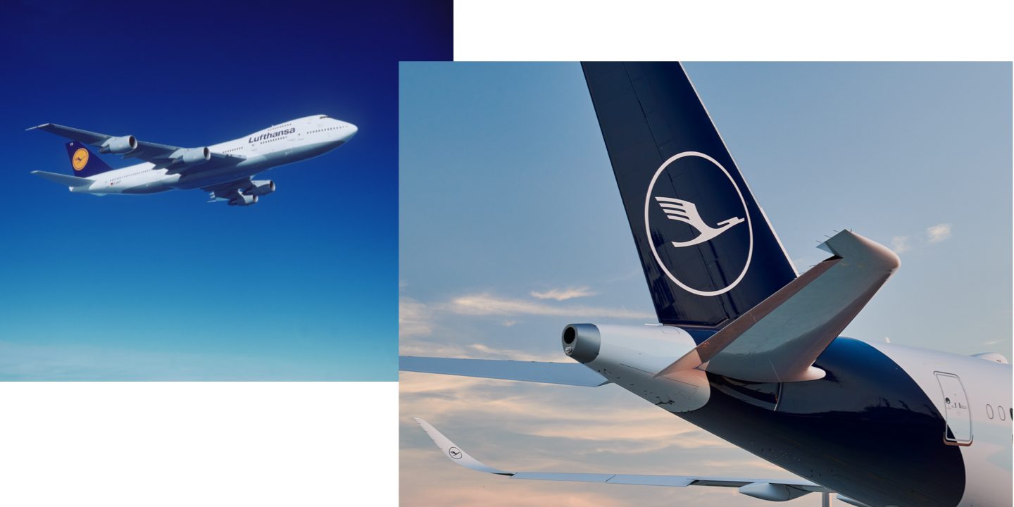
When the crane celebrates its centenary in 2018, the brand takes on a modern, new look: A new blue and a bespoke typeface express Lufthansa’s new self-image as a premium brand. The color yellow takes a back seat and is used only in subtle accents.
A symbol of future promise
Trust, reliability, and progress – that’s what the Lufthansa crane stands for. Colors, typography, and layouts have changed, services and product ranges have improved, but the crane has remained the common thread throughout the company’s history. A bird that has always remained the same, yet has reinvented itself with each generation.